
As the digital landscape rapidly shifts, Google has unveiled a fresh look for its iconic logo, marking its first redesign in nearly a decade. This change comes as part of a larger initiative to modernize its brand identity and emphasize the company’s increasing focus on artificial intelligence (AI) and innovation-driven solutions.
The Previous Logo and Its Impact
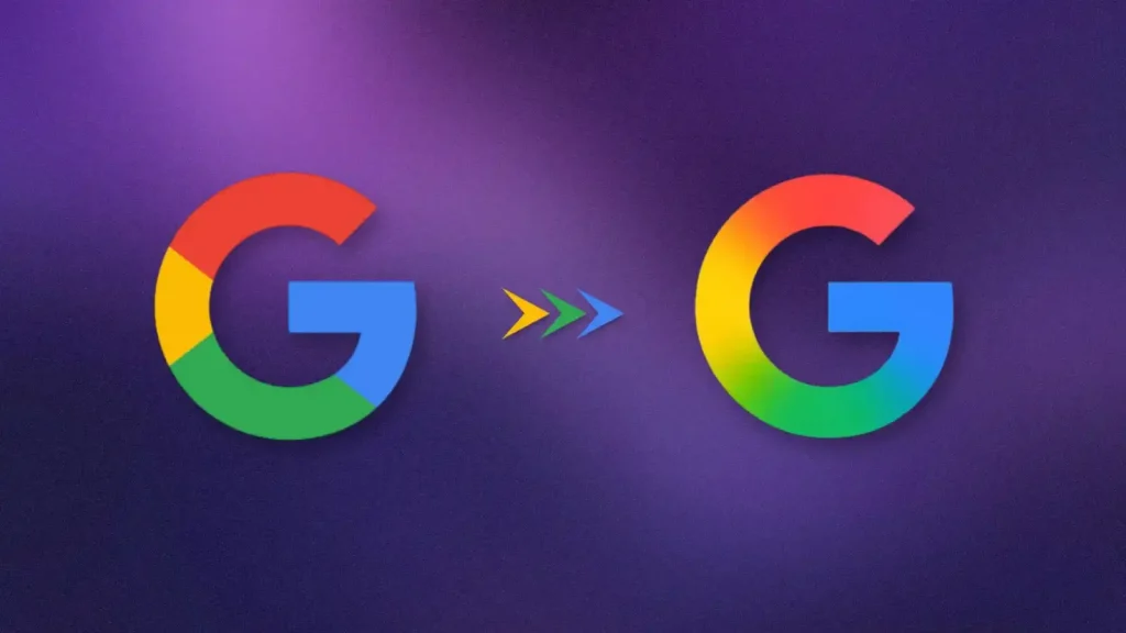
The previous version of Google’s logo, introduced in September 2015, became synonymous with the company’s visual identity. Featuring vibrant, solid colors, it was simple yet effective in conveying Google’s playful yet professional image. However, with the tech world’s growing emphasis on AI and machine learning, Google’s branding needed a subtle shift to reflect its evolving role in these areas.
A Subtle Yet Significant Change
The new logo represents a refined aesthetic, maintaining the essence of Google’s original design while incorporating a more modern and streamlined look. This update emphasizes the company’s commitment to staying at the forefront of technological innovation, particularly in the realm of artificial intelligence. It is not a drastic overhaul but rather a thoughtful, subtle transformation to keep pace with the changing demands of the digital world.
The logo refresh is already visible on the Google Search app for iOS and has started appearing on Android devices, initially rolling out on Pixel smartphones. However, the “G” logo, with its distinct color separations, still appears on the web and on some Android devices, marking a gradual transition.
Google’s Logo Evolution: From 1998 to Today
Since its founding in 1998, Google’s logo has undergone several iterations. In its early years, the company used a logo with a playful, colorful design and even an exclamation mark to capture the exuberance of the early internet era. Over time, the brand evolved, becoming synonymous with minimalism and clarity as it grew into the tech giant we know today.
The new logo fits within this lineage, showcasing Google’s shift towards a more refined and forward-thinking identity, particularly as the company becomes increasingly focused on AI and seamless user experiences.
Public Reaction: Mixed Responses to the Update
The unveiling of the new logo has been met with a range of reactions. While some users have praised the updated aesthetic for its sleek and modern look, others have criticized the change as being too subtle. This mixed response reflects the challenge of balancing innovation with tradition, particularly for a company as globally recognized as Google.
Nevertheless, the redesign signals more than just a cosmetic change; it underscores Google’s ongoing commitment to adapting to the fast-paced world of technology and staying relevant in a highly competitive market.